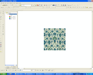
I found this beautiful persin ornament. Link to the source: http://www.taschen.com/pages/en/community/archive_ornament/ |
 |
| I add it to ArcMap as a layer: |
 |
I made new polygon shapefile. This is the first square. |
 |
Other squares copied with "Mirror features" (set snapping to vertices). This initial layer of squares should cover only one repeatable motif (well, mine is a little bit bigger here). |
 |
I get multiple colours by symbolizing. That means to assign different ID values to squares with different colours and then assign colours to them with symbolization. I select those squares whose colours will be similar, open attribute table and then assign to their's ID fields similar values by "calculate field". Actully I have to do this with one repeatable motif only. Then I can copy this motif to any direction using "Mirror features". Wish to change colours? Just select the needed squares and assign to them another value. |
|
You can mirror motifs with ArcMap. You can put the original picture (the photo of a textile for example) in the background. Changing colour is easier in ArcMap, I think. Well, not everybody has ArcMap on his/her PC, that is minus. |
Tuesday, March 2, 2010
Making charts using ArcMap
Subscribe to:
Post Comments (Atom)


No comments:
Post a Comment